Business Insights 360
Developed an interactive Power BI dashboard integrating MySQL & Excel to provide 360-degree business insights. Designed 4 key analytical views covering P&L analysis, revenue trends, gross margin, and financial KPIs. Implemented ETL processes for data transformation and built 10+ KPIs to track profitability, sales performance, and business health.
Project Info
- Company Name: (imaginery) AtliQ Hardware
- Domain: Electronic Goods
- Business Model: B2B
- Duration: 40 hours
Problem Statement
AtliQ Hardware is one of the fastest-growing companies, selling products such as PCs, keyboards, and other hardware components globally.
However, when the company attempted to expand its business into the Latin American market, it suffered significant losses.
Upon investigation, it was discovered that the decision was made based on intuition and survey responses rather than relying on historical data and concrete numbers.
Business Goal/ Motive of the project
AtliQ Hardware now aims to develop a comprehensive dashboard that consolidates data from finance, sales, marketing, and supply chain operations. The objective is to enable data-driven decision-making to avoid similar setbacks in the future.
Business Needs for Dashboard Development
They require 5 consecutive dashboards:
- Finance view
- P&L Statement for: Markets, Products & Customers
-
Sales View:
- top/bottom customers
- Key metrics - understand their performance
- Marketing View:
- top/bottom customers
- Key metrics - understand their performance
-
Supply Chain:
- Reliability
- Forecast Accuracy
-
Executive View:
- Integrated view of Key Insights
Steps to follow when creating a dashboard
- Connect to Data
- Transform Data (Power Query)
- Data Modeling
- Add DAX Calculations
- Validate & Optimize
- Build Visuals (View by View)
- Design & Polish
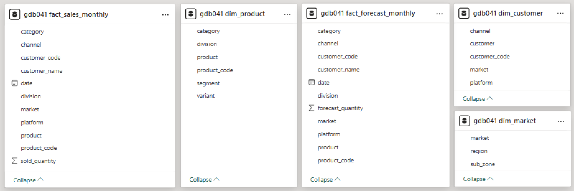
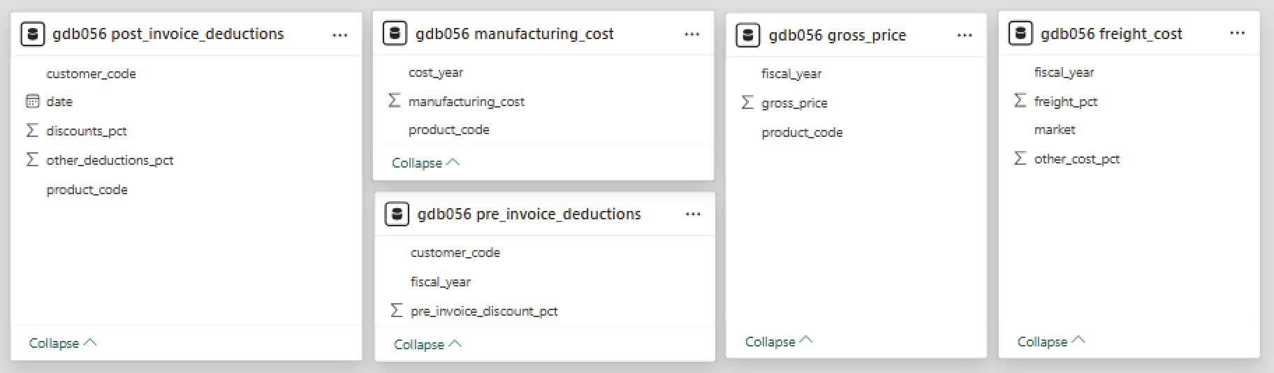
Data Tables Overview
Below images includes all the table names along with their column names. This is all the data I had when I started the project.
There are 2 databases:
gdb041: for Sales and Forecasting (Business Performance)
gdb056: for Cost and Pricing (Profitability Analytics)
Database: gdb041
Database: gdb056
Bored? | Watch my video presentation
Data Transformation | Date Table and Financial Metrics
Create a Date table with Fiscal Year
Start date(fact_sales table): Sep 2017
End date(fact_forecast table): Dec 2022
Fiscal Year Cycle: Sep to Aug
Date Table
= {Number.From(#date(2017,9,1))..Number.From(#date(2022,12,31))}
Fiscal Year Column
i.e. Fiscal year 2018 = Sep(9) 2017 to Aug(8) 2018
= {Number.From(#date(2017,9,1))..Number.From(#date(2022,12,31))}
Table with YTD and YTG data: COMBINED
For future analysis I will require a table with actual AND forecast data.
I will combine fact_sales table with fact_forecast table. We can see that both the tables have same column names so It will be easy append the tables.
We have to grab all the past months data from fact_sales table, and then for coming months we will require data from fact_forecast table. Review below screenshot for more clarification.
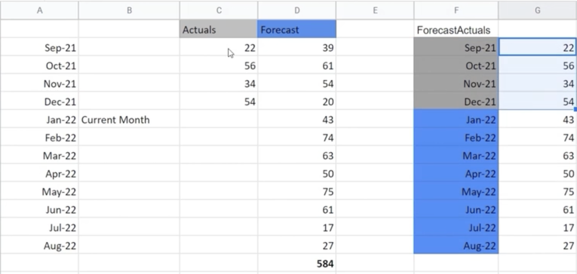
Reference table of fact_sales: fact_actuals_forecast
Reference Table of fact_forecast: remaining_months.
we don't need whole forecast table, we need data from last sale date.
LastSaleMonth = List.Month(#"gdb041 fact_sale_monthly"[date])
remaining_months = Table.SelectRows(source, each([date] > LastSaleMonth))
Append tables: fact_actuals_forecast | remaining_months
P&L and Financial Metrics Setup
Below Screenshot includes all the calculation for P&L Statement:
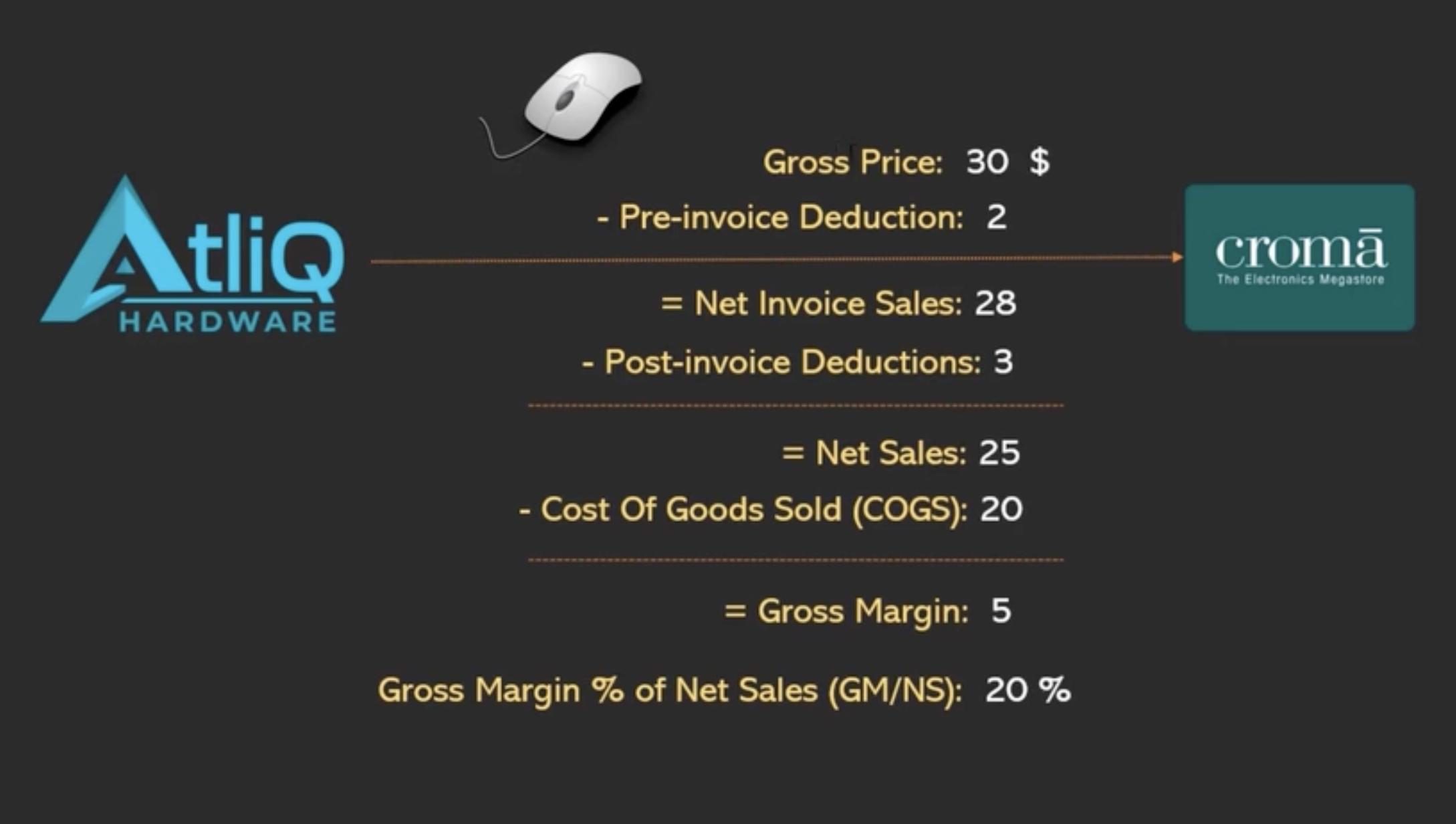
Merged tables in Power Query using primary, foreign, or composite keys based on the relationship between datasets. For example:
Gross Price
gross_sale_amount = [gross_price]*[Qty]
*Due to the high volume of data in post-invoice deductions (millions of rows), DAX was used to efficiently after that, to aggregate and compute key financial metrics.
Key Learnings
Creating a Date Table is a very important step, especially in professional reporting and Power BI dashboards.
Even Microsoft recommends this in official Power BI documentation.
Why creating a date table:
- Full use of time intelligence (YTD, QTD, MTD, etc.)
- All dates shown (even with no data)
- Easy to add fiscal year/month/week
- Smooth filters like "Last 30 Days", "Current Quarter"
- Clean, reusable logic and measures
YTD: Year-to-Date (fact_sale table)
YTG: Year-to-Go (remaining_months table)
A composite key is a combination of two or more columns that together uniquely identify a row in a table (especially during joins or merges).
Data Modeling | P&L and Financial Metrics Setup
Before performing DAX calculations, it's essential to define relationships between tables — this process is known as data modeling.
Below Screenshot is consist of data model view:
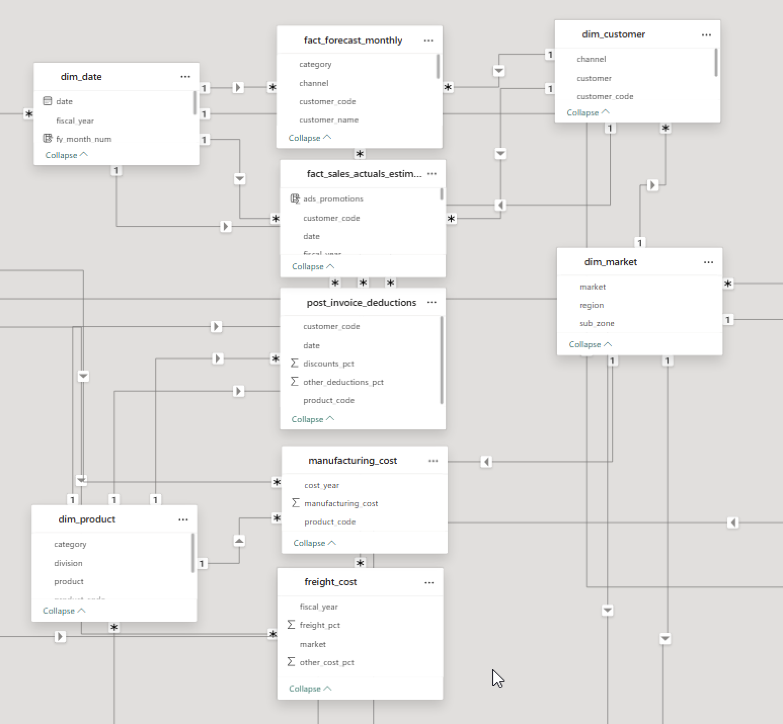
The data model follows a Snowflake Schema, with multiple fact tables and normalized dimension tables connected through composite and direct relationships.
Key Learnings
Data Transformation | P&L and Financial Metrics Setup
We will continue with post_invoice deduction, but with DAX columns.
Post invoice deduction amount
post_invoice_deduction_amount =
    var res =
        CALCULATE(
            MAX(post_invoice_deductions[discounts_pct]), RELATEDTABLE(post_invoice_deductions)
        )
    return res*fact_sales_actuals_estimates[net_invoice_sale_amt]
Post invoice other deduction amount
post_invoice_other_deduction_amount =
    var res =
        CALCULATE(
            MAX(post_invoice_deductions[other_deductions_pct]), RELATEDTABLE(post_invoice_deductions)
        )
    return res*fact_sales_actuals_estimates[net_invoice_sale_amt]
Net Sale amount
Net Sale amount = NIS - all post invoice
net_sale_amt =
    fact_sales_actuals_estimates[net_invoice_sale_amt]
    -fact_sales_actuals_estimates[post_invoice_deduction_amount]
    -fact_sales_actuals_estimates[post_invoice_other_deduction_amount]
Manufacturing Cost
Manufacturing Cost = Manufacturing Cost * Quantity
manufacturing_cost =
    var res =
        CALCULATE(
            MAX(manufacturing_cost[manufacturing_cost]), RELATEDTABLE(manufacturing_cost)
        )
    return res*fact_sales_actuals_estimates[Qty]
Freight Cost, Other Cost
Freight Cost = Freight Cost * net Sale amount
freight_cost =
    var res =
        CALCULATE(
            MAX(freight_cost[freight_pct]), RELATEDTABLE(freight_cost)
        )
    return res*fact_sales_actuals_estimates[net_sale_amt]
other_cost =
    var res =
        CALCULATE(
            MAX(freight_cost[other_cost_pct]), RELATEDTABLE(freight_cost)
        )
    return res*fact_sales_actuals_estimates[net_sale_amt]
Total COGS
COGS = Manufacturing Cost + Freight Cost + Other Cost
total_cogs_amount =
    fact_sales_actuals_estimates[manufacturing_cost]
    +fact_sales_actuals_estimates[freight_cost]
    +fact_sales_actuals_estimates[other_cost]
Total COGS
COGS = Manufacturing Cost + Freight Cost + Other Cost
total_cogs_amount =
    fact_sales_actuals_estimates[manufacturing_cost]
    +fact_sales_actuals_estimates[freight_cost]
    +fact_sales_actuals_estimates[other_cost]
Key Learnings
Filter Context are what filters are currently active on your data when a DAX formula is being calculated.
Used CALCULATE function to change filter context.
Data Preparation | Validation and Optimization
Data Validation (with Stakeholder Check)
To ensure data accuracy, I performed a manual validation step:
- - Connected with the stakeholder to gather key reference metrics (e.g., total revenue).
- - Cross-verified those numbers against the loaded dataset.
- - Created basic summary visuals (cards/charts) to confirm consistency before proceeding.
File Optimization (using DAX Studio)
To enhance model performance and reduce size, I conducted targeted file optimization:
- - Used DAX Studio to analyze table size and memory usage.
- - Removed derived columns that can be recalculated via database queries:
- - gross_price
- - pre_invoice_pct
- - pre_invoice_amt
- - Eliminated calculated fields that replicate basic Excel logic and can be handled by Power BI visuals:
- - total_cogs_amt
- - gross_margin
Result: Reduced the Power BI file size by ~70 MB, improving load time and responsiveness.
1. Finance View | Custom P&L Statement Setup
Built a flexible and finance-friendly Profit & Loss (P&L) statement in Power BI by defining a static structure and linking it with dynamic measures.
Steps Involved
- Designed Static Structure in Excel: Created a table with ordered P&L line items (e.g., Gross Sales, COGS, Net Profit), imported into Power BI as a disconnected table P & L Row.
- Configured Column Layout: Added a second disconnected table P & L Column to define dynamic columns like Benchmark, selected year from filters etc.
- Created DAX Measure: Used SWITCH(TRUE()) logic in a measure called P & L Values to return appropriate values for each line item.
Measure Logic
P & L Row Structure
P & L Values Measure
P & L Values =
    var res= SWITCH(
        TRUE(),
        MAX('P & L Row'[Order]) = 1, [GS $]/1000000,
        MAX('P & L Row'[Order]) = 2, [Pre Invoice Deduction]/1000000,
        MAX('P & L Row'[Order]) = 3, [NIS $]/1000000,
        MAX('P & L Row'[Order]) = 4, [Post Invoice Discount]/1000000,
        MAX('P & L Row'[Order]) = 5, [Post Invoice Other Deductions]/1000000,
        MAX('P & L Row'[Order]) = 6, [Total Post Invoice Deduction]/1000000,
        MAX('P & L Row'[Order]) = 7, [NS $]/1000000,
        MAX('P & L Row'[Order]) = 8, [Manufacturing Cost $]/1000000,
        MAX('P & L Row'[Order]) = 9, [Freight Cost $]/1000000,
        MAX('P & L Row'[Order]) = 10, [Other Cost $]/1000000,
        MAX('P & L Row'[Order]) = 11, [Total COGS $]/1000000,
        MAX('P & L Row'[Order]) = 12, [GM $]/1000000,
        MAX('P & L Row'[Order]) = 13, [GM %]*100,
        MAX('P & L Row'[Order]) = 14, [GM/unit],
        MAX('P & L Row'[Order]) = 15, [Operational Expense $]/1000000,
        MAX('P & L Row'[Order]) = 16, [NP $]/1000000,
        MAX('P & L Row'[Order]) = 17, [NP %]*100
    )
return
IF(HASONEVALUE('P & L Row'[Description]), res, [NS $]/1000000)
P & L Final Value =
    SWITCH(
        TRUE(),
        SELECTEDVALUE(fiscal_year[fy_desc]) = MAX('P & L Columns'[Col Header]),
        [P & L Values],
        MAX('P & L Columns'[Col Header]) = "BM", [P & L BM],
        MAX('P & L Columns'[Col Header]) = "Chg", [P & L Chg],
        MAX('P & L Columns'[Col Header]) = "Chg %", [P & L Chg %]
    )
P & L Column
P & L Columns =
var x = ALLNOBLANKROW(fiscal_year[fy_desc])
return
UNION(
    ROW("Col Header", "BM"),
    ROW("Col Header", "Chg"),
    ROW("Col Header", "Chg %"),
    x
)
Key Learnings
- Disconnected row + column tables for layout control
- Dynamic DAX logic for line-item selection and column switching
- Unit scaling and percentage formatting
- Financial logic separation (Actual, Benchmark, Variance)
2. Sales & Marketing View
No additional data transformation is required for the Sales view. We can directly build visuals using the existing model.
Essential Sales View Metrics
- Performance Metrics
- Net Sales ($) (NS $) – Total revenue from sales
- Gross Margin ($ / %) (GM $ / GM %) – Profitability indicator
- Customer/Store-level performance – Breakdown by customer with NS $, GM $, GM %
- Customer Segmentation
- Top Customers by Net Sales
- Top Customers by GM %
- Customer-wise Trend Comparison (vs LY or Target)
- Product Segmentation
- Product Category/Segment-wise NS $ and GM %
- Best/Worst Performing Products
- Unit Economics
- Pre-invoice deductions
- Post-invoice deductions
- COGS (Cost of Goods Sold)
- Visual Breakdown using donut/pie charts
The Sales view will include the following components:
- 1. Scatter Chart: Integrated with a slicer for target gap tolerance to analyze performance distribution.
- 2. Tooltip Creation: Designed custom tooltips to provide deeper insights on hover.
1. Scatter Chart with target gap tolerance
- Created a manual table using GENERATESERIES for user input through slicer:
Target Gap Tolerance 2 = GENERATESERIES(0, 0.2, 0.01) - Used this table as a slicer to let users select a GM% gap threshold.
- Created a variance calculation to measure deviation from the benchmark:
GM % Variance = [GM BM %] - [GM %] - Created a binary filter measure to include/exclude points from scatter chart:
GM % Filter = IF( [GM % Variance] >= SELECTEDVALUE('Target Gap Tolerance 2'[Target Gap Tolerance]), 1, 0 ) - Used GM % Filter in the visual-level filters of the scatter chart.
2. Tooltip Creation
Created new report, changed page settings and added necessary chart
for dynamic title:
Sales View Tooltip = "NS and GM % for " & SELECTEDVALUE(dim_customer[customer]) & " " & SELECTEDVALUE(dim_product[segment])
Key Learnings
- Target Gap Tolerance: A limit set by the user to show only those data points (like customers or products) that are close enough to the target or benchmark.
For example, if the target Net Sales is ₹10 million and the Target Gap Tolerance is set to 10%, only those customers whose Net Sales are within ±10% of ₹10 million (i.e., between ₹9M and ₹11M) will be shown. This helps focus only on relevant or closely performing entities. - GENERATESERIES: A DAX function that creates a one-column table of values, useful for building dynamic slicers like tolerance limits.
- SELECTEDVALUE: Returns the selected value from a slicer. Used to apply user selection dynamically in DAX measures.
- Visual Filter with Measure: A common technique to hide/show points in visuals like scatter charts based on business logic.
- GM % Variance: The difference between benchmark GM% and actual GM%. Helps track whether performance is within tolerance.
Essential Marketing View Metrics
- Net Sales (NS $) per product
- Gross Margin (GM % and GM $)
- Net Profit (NP % and NP $)
- Monthly trend of NS $ and GM %
- Top-performing products
- Cost vs Margin (COGS donut chart)
- P&L breakdown (GM, OpEx, NP)
3. Supply Chain View
Essential Marketing View Metrics
- Net Error: Actual - Forecast
- ❌ Over-forecasting: less actual, more forecast EI(excess Inventory)
- ✅ Under-forecasting: more actual, less forecast, OOS(out of stock)
- Abs Error: |Actual - Forecast|
- Forecast Accuracy FA % = (1 - (|Actual - Forecast| / Actual)) × 100
- Risk
Live Dashboard
DAX functions
P & L LY = CALCULATE([P & L Values], SAMEPERIODLASTYEAR(dim_date[date]))
Slicers
Created slicers to allow users to interactively filter and explore the data based on selected criteria.
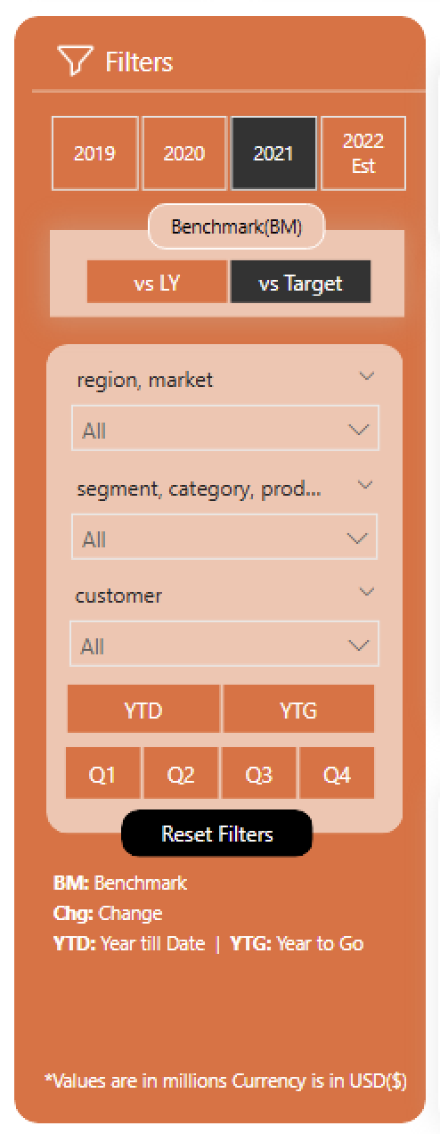
Year Slicer
Created another table by manually entering data, fiscal_year, fy_desc
Use fiscal_year for calculations and relationships (from date table)
Use fy_desc for display in visuals
Benchmark Slicer
Created a manual table for benchmark options like LY and Target:
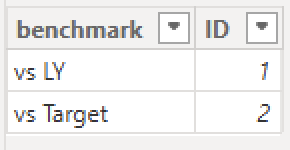
This is a custom slicer. To make visuals respond dynamically, you need to create separate measures for each benchmark and then combine them using logic based on slicer selection.
Step 1: Create supporting measures
NS LY $ =
CALCULATE(
    [NS $],
    SAMEPERIODLASTYEAR(dim_date[date])
)
NS Target $ =
VAR tgt = SUM(NsGmTarget[ns_target])
RETURN IF([product / customer filter check], BLANK(), tgt)
product / customer filter check =
IF(
    ISCROSSFILTERED(dim_product[product]) ||
    ISCROSSFILTERED(dim_customer[customer]),
    TRUE(),
    FALSE()
)
Step 2: Create the unified benchmark measure
NS BM =
VAR tgt =
    SWITCH(
        TRUE(),
        SELECTEDVALUE(benchmark[ID]) = 1, [NS LY $],
        SELECTEDVALUE(benchmark[ID]) = 2, [NS Target $]
    )
RETURN IF([product / customer filter check] = TRUE(), BLANK(), tgt)
The NS BM measure dynamically switches between benchmarks based on slicer selection. It ensures results are shown only at the appropriate level (e.g., total market), not when a specific product or customer is filtered.
BM message for blank KPI Cards
BM Message = IF([NS BM] = BLANK() || [GM BM %] = BLANK() || [NP BM %] = BLANK(), "*BM Target(s) is not available for the selected filters", "")
YTD/ YTG Slicer
Created a calculated column in the dim_date table called ytd_ytg. Since this column is directly related to the date dimension, we can use it in visuals and slicers without creating additional measures.
ytd_ytg =
    var LastSalesDate = MAX(last_sale_date[last_sale_date])
    var FYMonthNum = MONTH(DATE(YEAR(LastSalesDate), MONTH(LastSalesDate)+4, 1))
    return
    IF(dim_date[fy_month_num]> FYMonthNum, "YTG", "YTD")
Quarter Slicer
Same as YTD/ YTG Slicer
quarter = "Q" & ROUNDUP( DIVIDE(dim_date[fy_month_num], 3, 0), 0)
Reset Filter Button
Created a bookmark named Remove Filters with all filters cleared.
Added a button and set its Action property to trigger this bookmark, allowing users to reset all filters with a single click.
Key Learnings
- Manual Slicers: Created custom slicer tables for Fiscal Year and Benchmark, giving flexibility in display and control over calculations.
- Fiscal Year Slicer: Used fiscal_year from the Date table for relationships and calculations, and fy_desc for cleaner visual labels.
- Benchmark Slicer: Custom table used to toggle between metrics like Last Year and Target. Required separate measures for each benchmark scenario.
- YTD/YTG Logic: Added a calculated column ytd_ytg in the Date table to classify months as Year-To-Date or Year-To-Go based on the latest sales date.
- Reset Filters: Created a bookmark named Remove Filters with all filters cleared. Linked this to a button to help users reset the report view easily.
Technical Verbs
Slicers and Filters
| Feature | Slicers | Filters |
|---|---|---|
| What it is | A visual element users interact with | A background-level configuration set in the Filter Pane |
| User Visibility | Visible on the report canvas | Visible only in the filter pane |
| Interactivity | User can select/deselect values | Usually fixed by report designer |
| Scope | Page-level (affects visuals on that page) | Visual-level, Page-level, or Report-level |
| Common Types | Dropdown, Checkbox, Range, Relative Date | Visual Filter, Page Filter, Report Filter, Top N, Drillthrough |
| Use Case | Let users explore data (e.g., select year, category) | Restrict or predefine the data shown in visuals |
| Best For | User control and interaction | Applying rules and hiding filter logic |